South East Journey
Not a feed to consume, but a memory to explore.
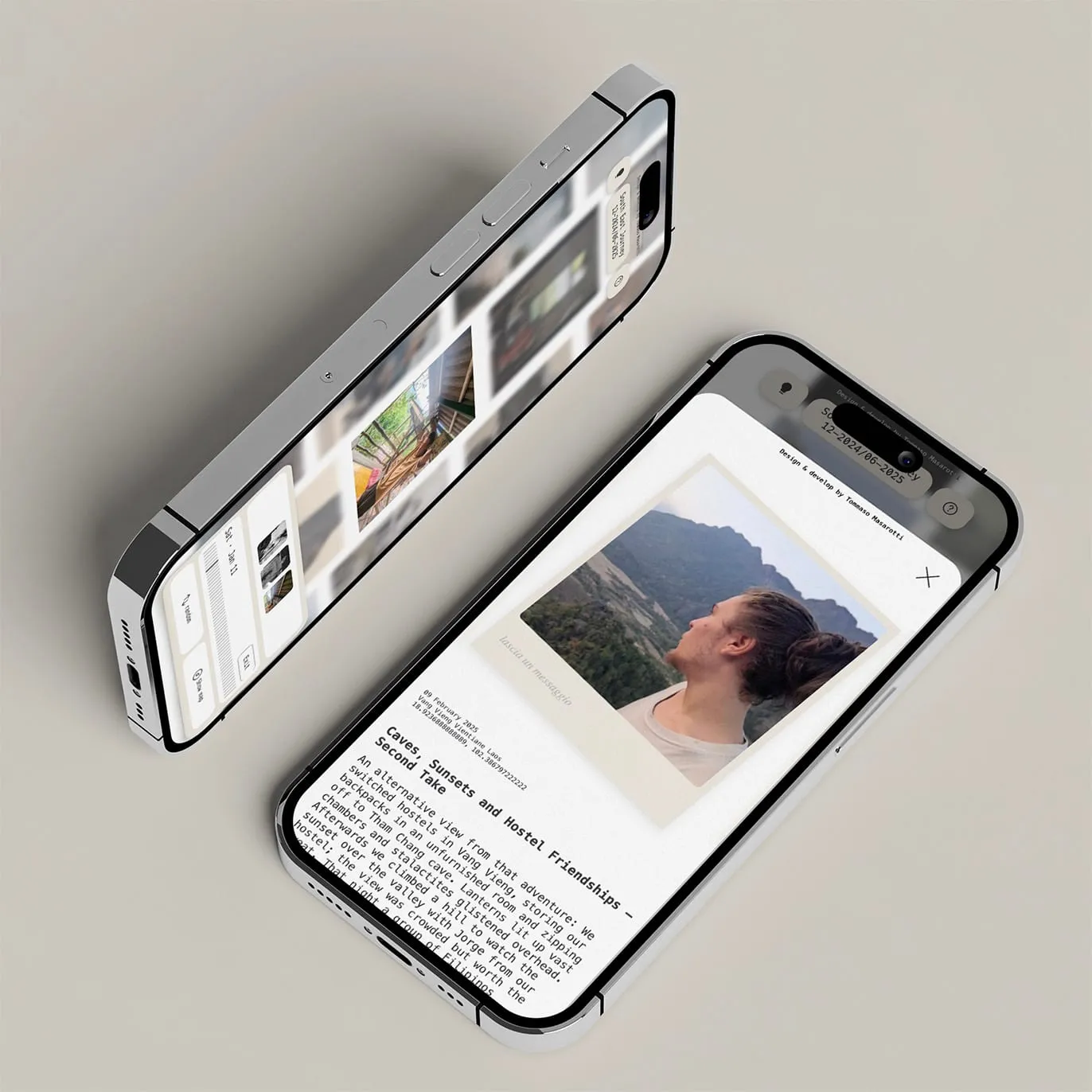
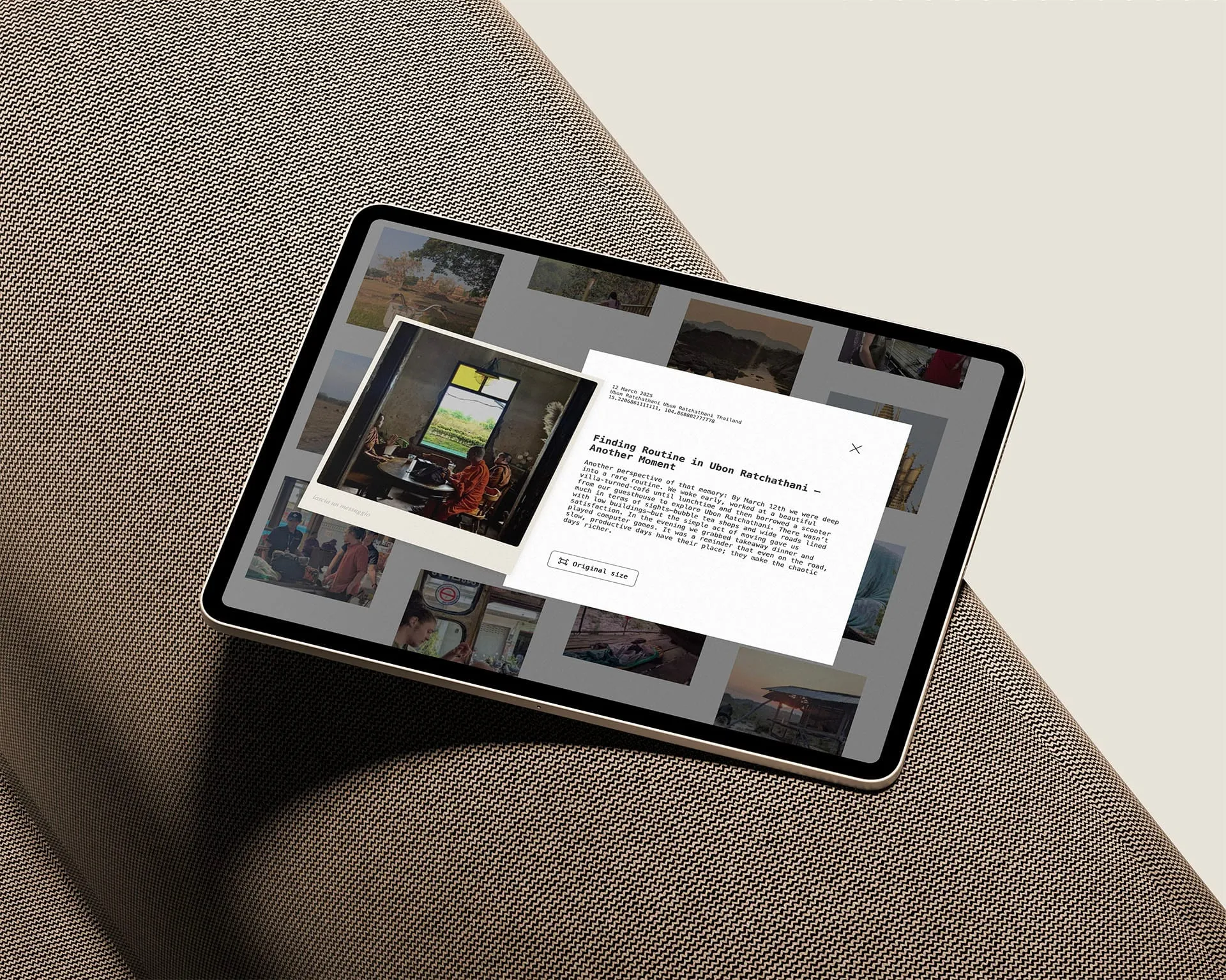
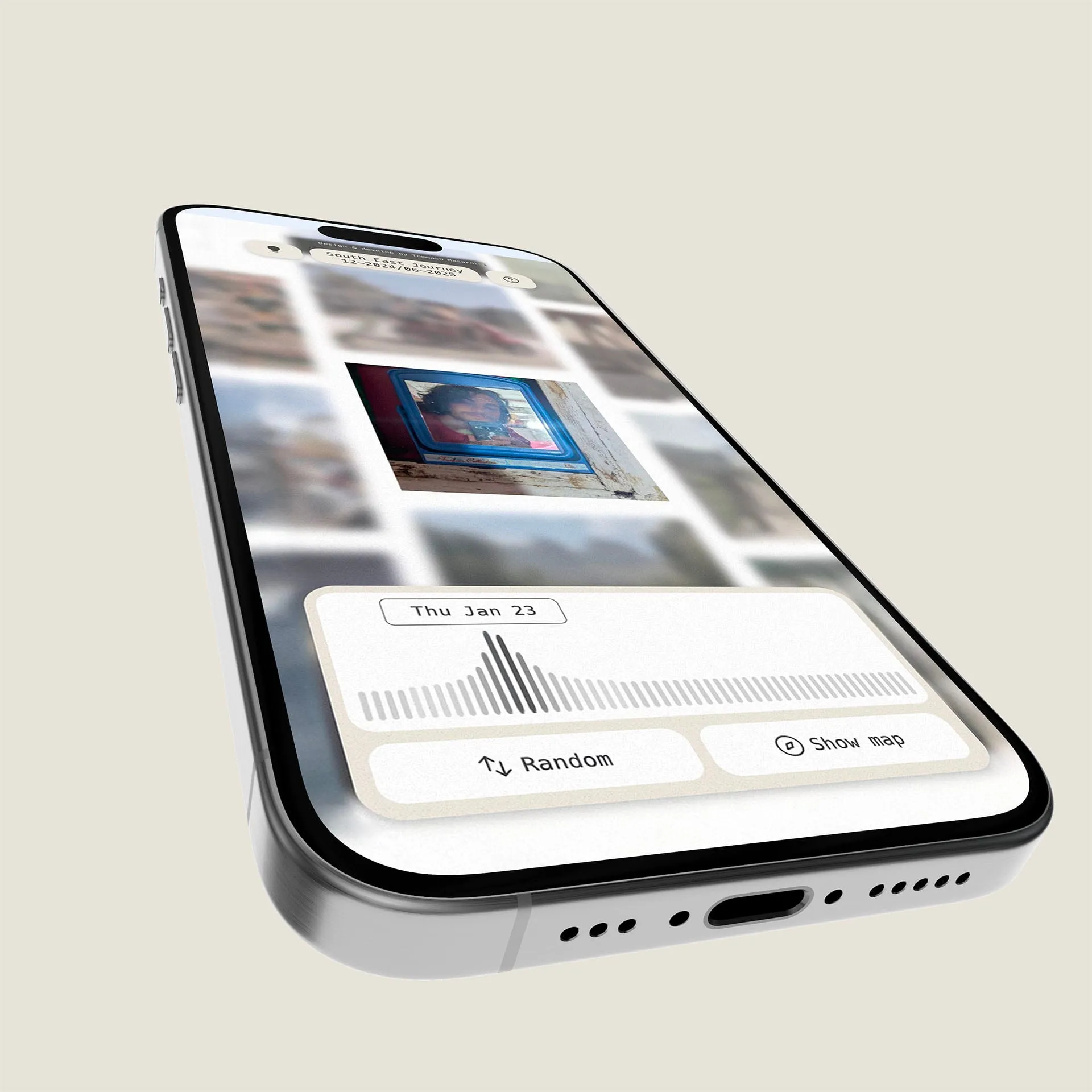
During a year spent working remotely and travelling with a backpack across Thailand and Laos, I wanted a better way to share everyday life with my family. Until then, most of those moments lived inside phone calls. I could tell them what had happened, but they couldn’t really see the journey taking shape. A traditional photo feed wasn’t the answer either if all I wanted was chronological sharing, existing platforms already did that. The difference was the audience. I wasn’t trying to capture the attention of strangers. The people visiting already cared about me and had a reason to explore. That allowed me to design around curiosity rather than consumption. I built a private, mobile-first visual archive where photographs can be discovered through a draggable grid, revisited through a timeline, or located on a map. The core interaction remains deliberately simple enough for less digitally confident family members: see a photograph, tap it, read what happened that day. What started as a way to share a journey eventually became the archive of that year. Not a feed to consume, but a memory to explore.
Project Details
Complexity When You Want It
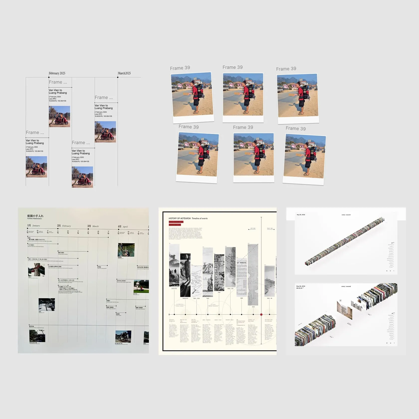
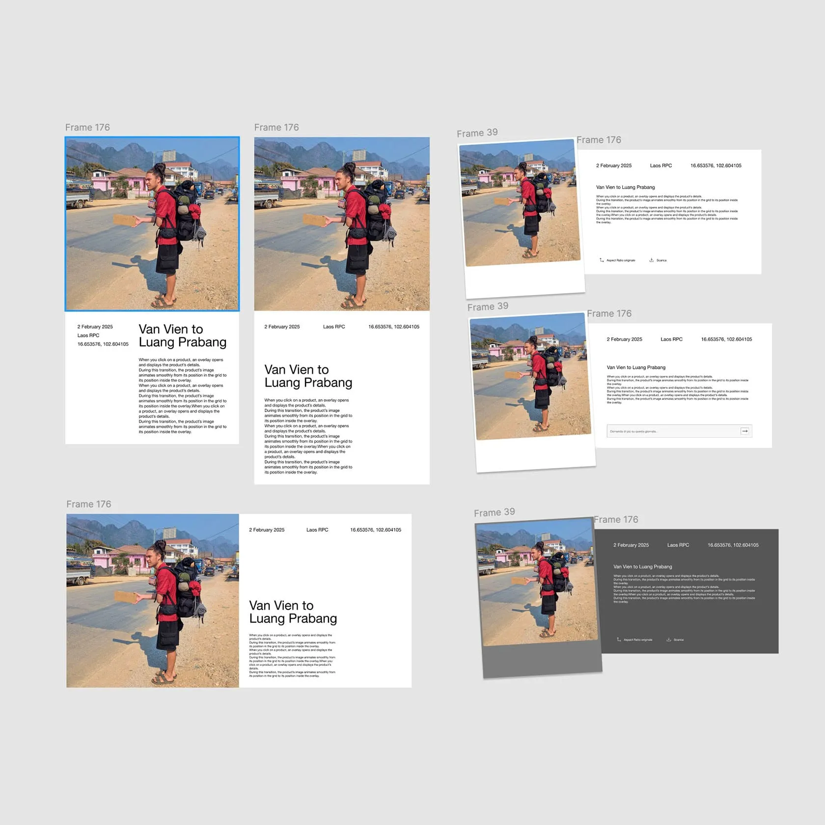
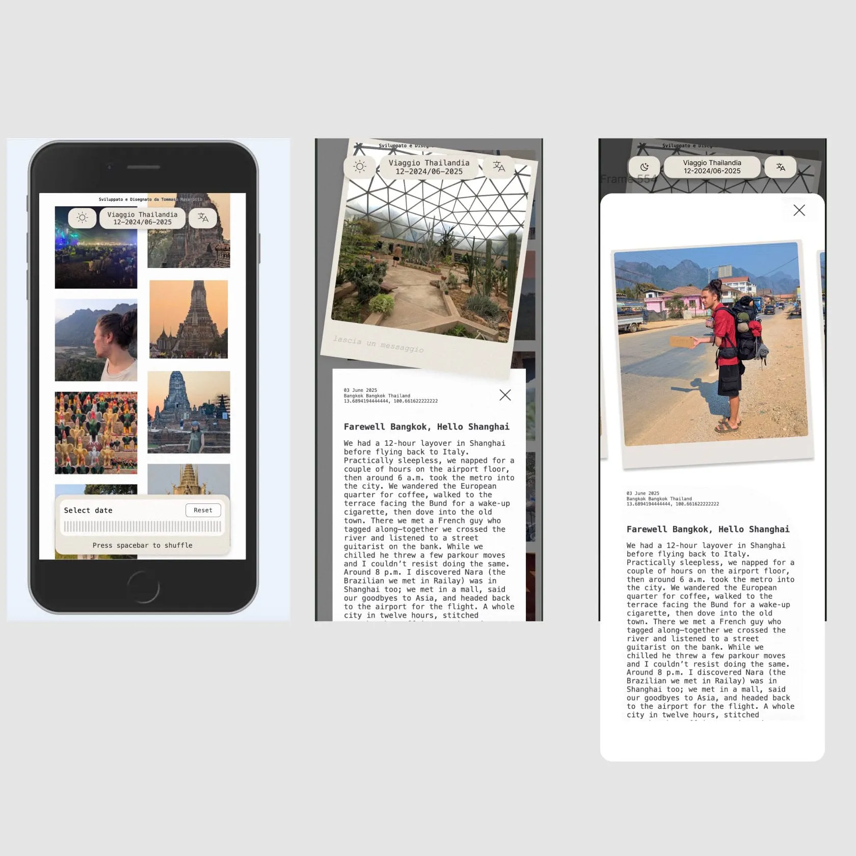
The audience ranged from my grandmother, who can struggle with complex digital interfaces, to family members comfortable exploring more advanced controls. Rather than designing the entire experience around one level of digital confidence, I separated the essential interaction from the optional ones. At its simplest: See a photo → Tap it → Read the day Large visual targets, generous empty space and familiar gestures keep that path straightforward. Timeline navigation, photo clusters and the map sit one level deeper for anyone who wants them. The interface can be explored without first having to understand it. Complexity is available. It is never required.
Making Digital Memories Feel Physical
The visual language deliberately avoids the feeling of a polished social platform. Paper-like tones, grain and subtle imperfections give the archive the character of something collected over time, while photography remains the dominant element throughout. When selected, each image becomes a Polaroid-like object. Family members can even leave a free-form comment directly in its white space, no profiles, accounts or social mechanics. The interaction borrows from something familiar and physical: picking up a photograph, looking at it more closely and leaving a thought behind.
Outcome
The journey ended, and eventually I stopped adding new photographs. But the archive remained. My family and I still occasionally return to it, not to find new content, but to rediscover where we were, what happened that day, and moments we had forgotten. A tool for sharing the present became a place for revisiting the past.