Vino Matto
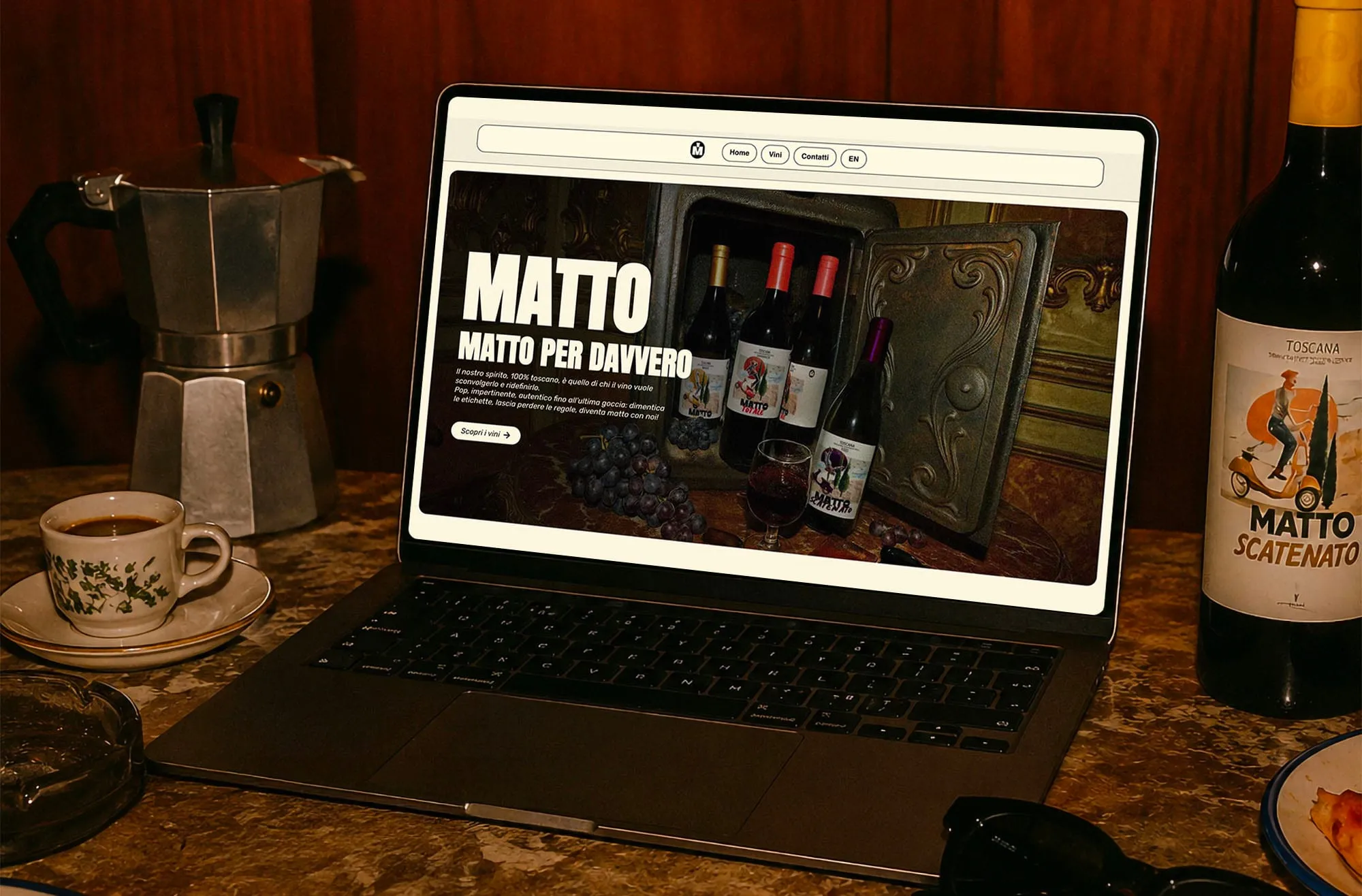
Giving a bold Italian wine brand a digital behaviour.
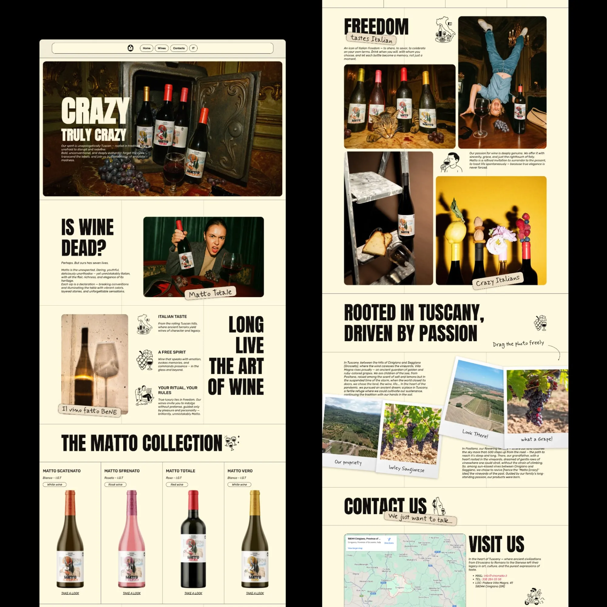
Visit Live SiteVino Matto is a Tuscan wine brand built around freedom, spontaneity and the pleasure of the Italian bella vita. Developed by RGB Comunicazione for Villa Magna, its identity deliberately moves away from the conventions of traditional wine culture to speak to a younger, international audience. When I joined the project, the brand already had a strong foundation. RGB had defined its strategy, identity, packaging and photographic direction. My role was to translate that world into a digital experience through information architecture, UX/UI, motion, image direction and development. The challenge was not to redesign Vino Matto, but to make sure its personality survived the transition to the web. A conventional wine website would have worked against everything the brand represented. I approached the website as an extension of the identity itself: editorial layouts inspired by printed magazines, tactile textures, unconventional compositions and small interactions turn browsing into something less rigid and more spontaneous.
Project Details
From brand identity to digital behaviour
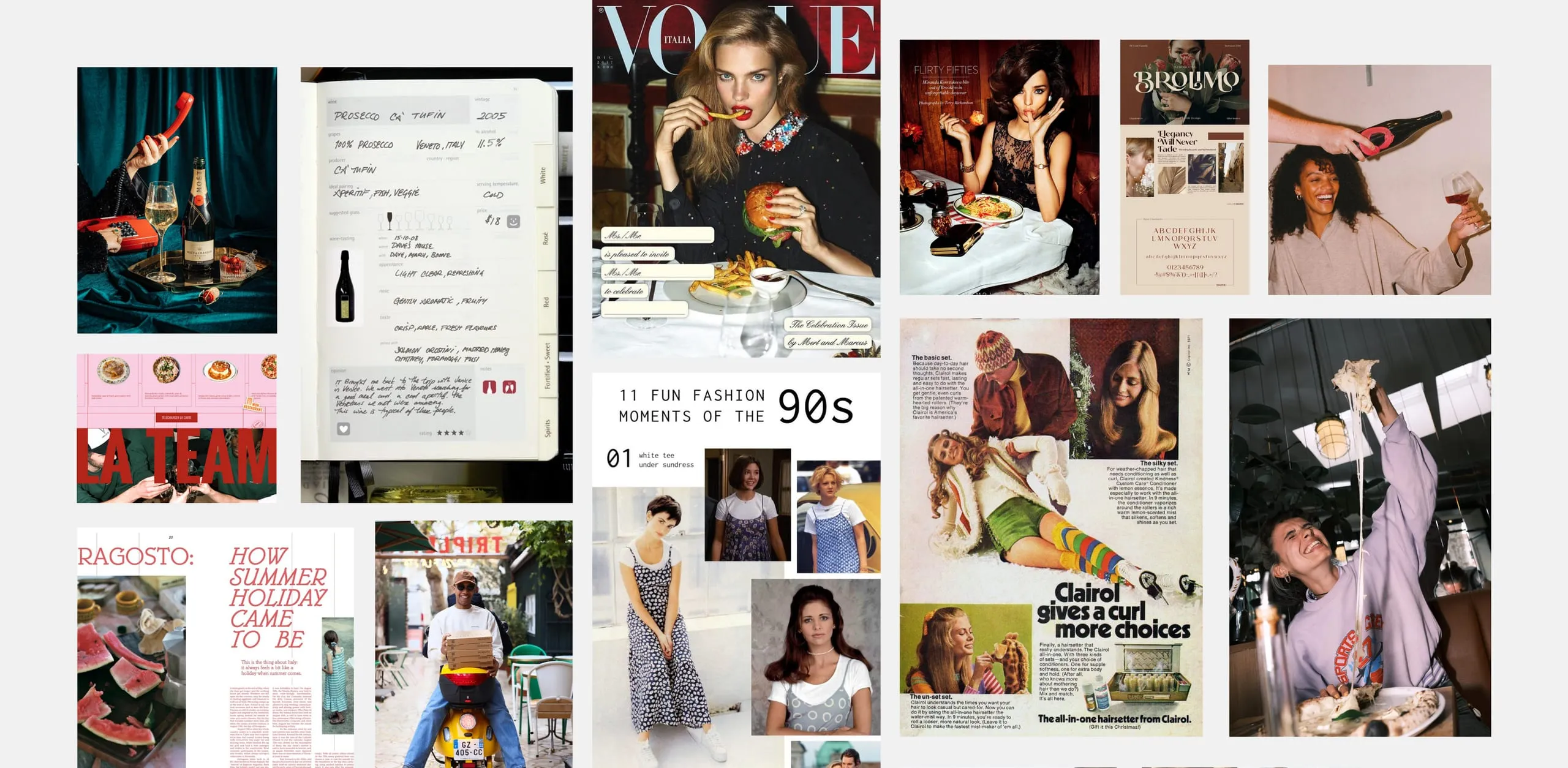
Vino Matto draws from an idealised Italy of freedom, long days, good company and a certain disregard for the rules. I translated that direction into an interface influenced by Italian editorial design and the visual culture surrounding the economic boom. Visible grids, paper textures and magazine-like compositions give the website a printed quality, while irregular text reveals, draggable elements and subtle GSAP interactions introduce controlled unpredictability. The interface doesn’t simply display the identity. It behaves like it.
Building a world beyond the bottle
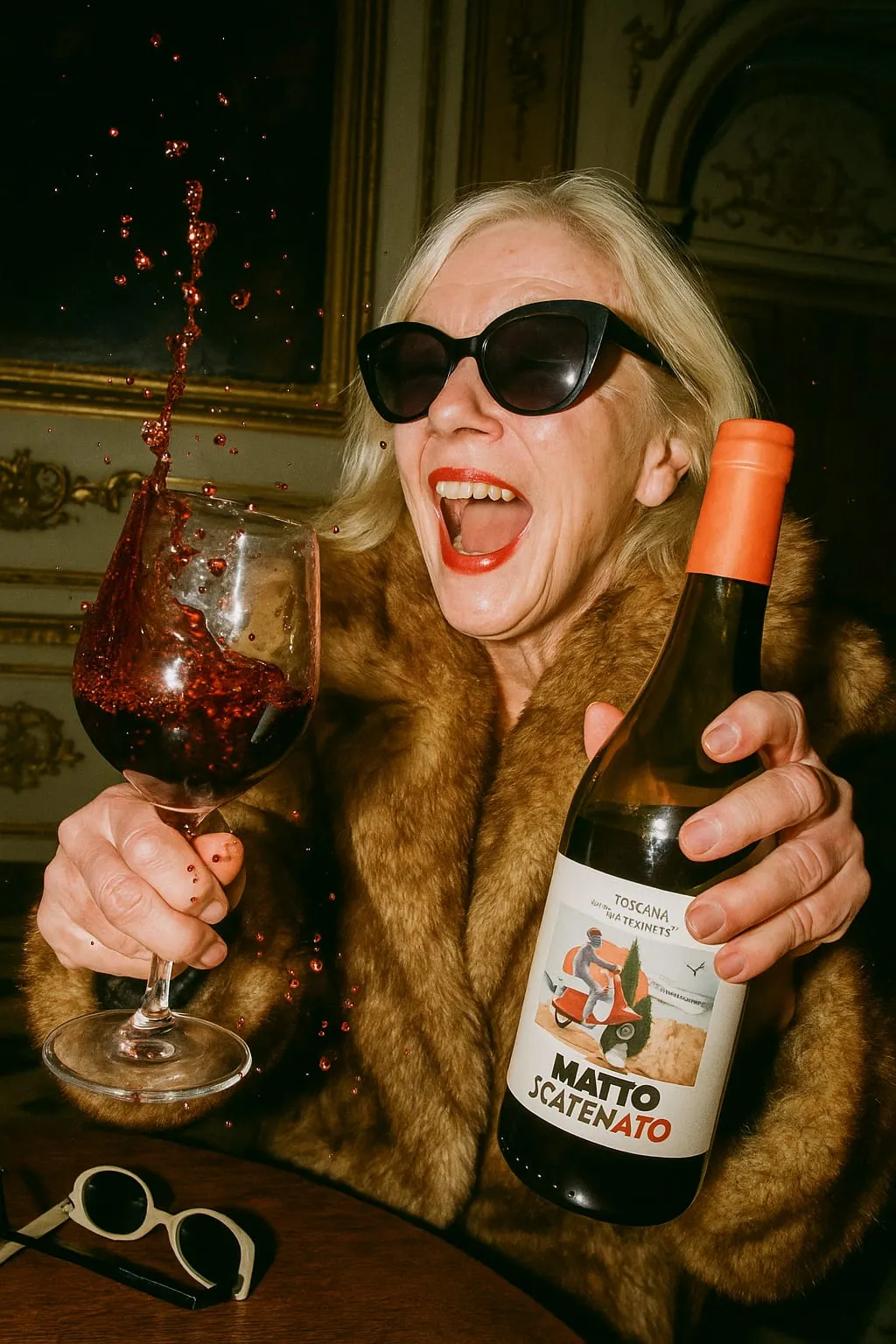
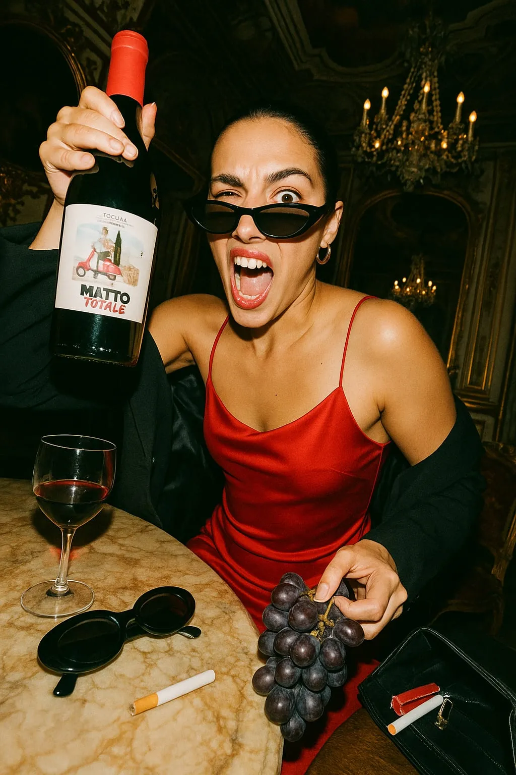
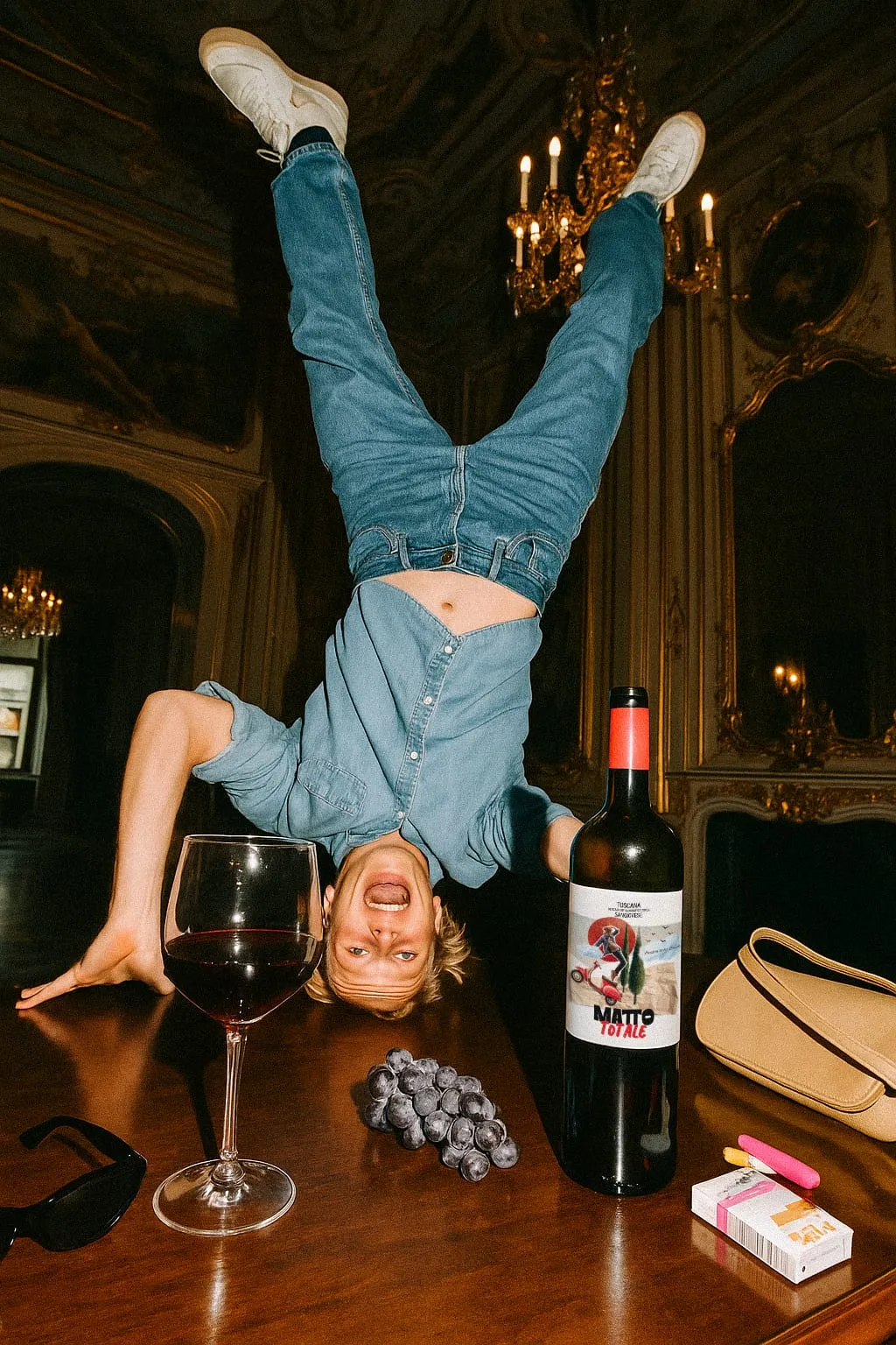
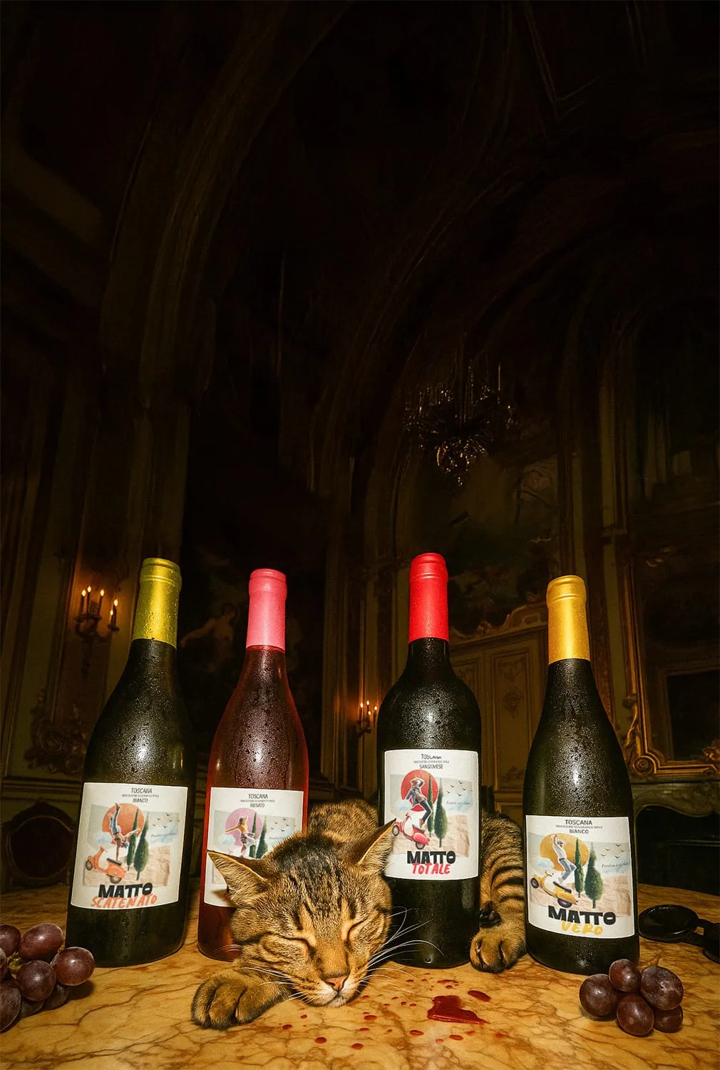
Starting from RGB’s photographic direction, I developed a consistent image-generation system to extend that visual world: young people, Italian villas, parties and deliberately unexpected situations became part of the brand’s digital imagery. The goal wasn’t to generate more content. It was to create the scenes the product photography couldn’t provide.
A wine menu, not a product page
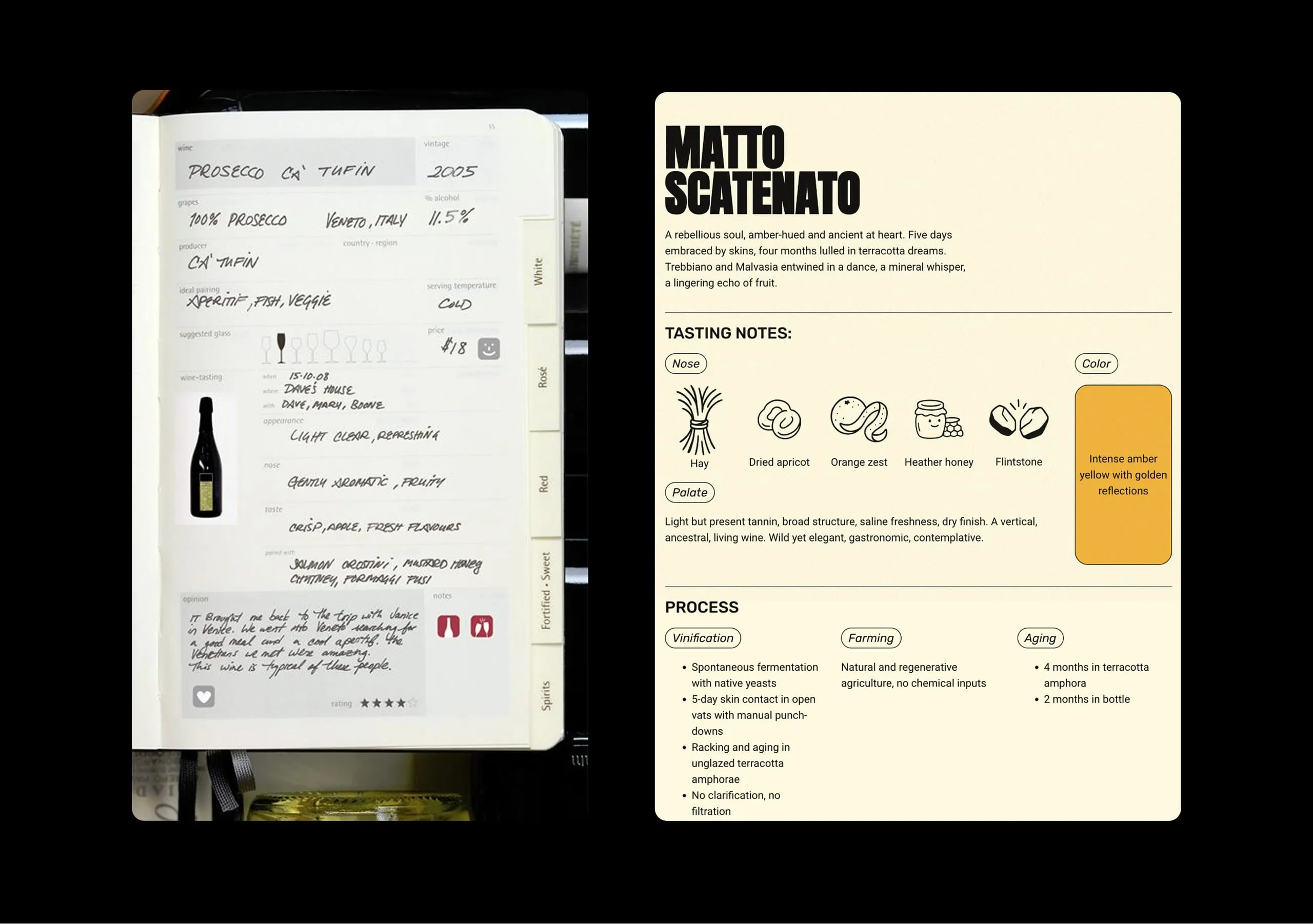
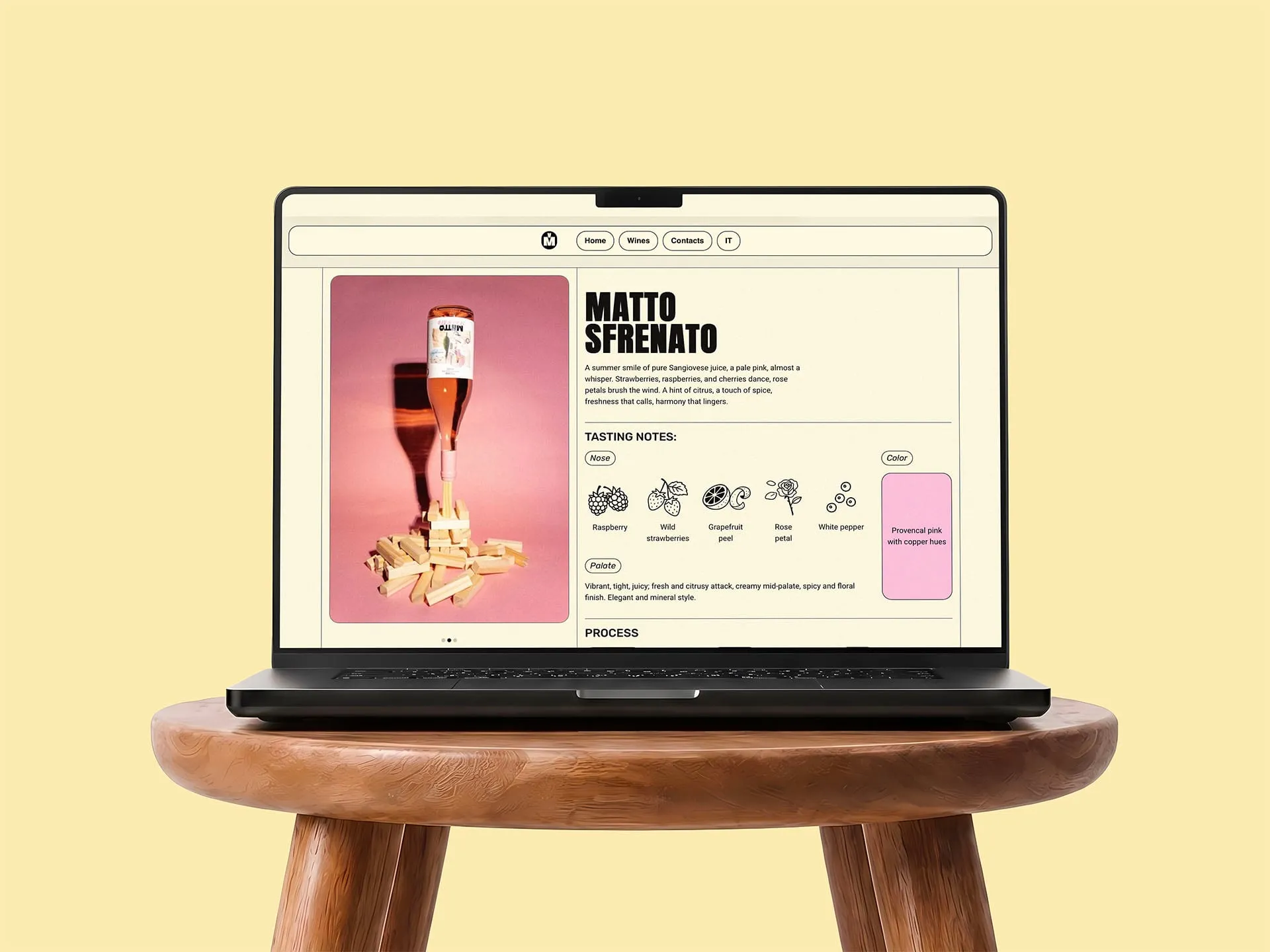
Instead of treating each wine like a conventional ecommerce product, I looked at something more familiar: the printed wine menus found in restaurants. Each organoleptic note was paired with a custom illustrated icon, developed through sketching, visual references and image generation. Technical information remains available, but it never overwhelms the experience.
Outcome
The digital experience extended Vino Matto’s identity beyond its labels and packaging, creating a coherent space for the brand, its lifestyle and its wines. The project, developed with RGB Comunicazione, received National Silver at the 38th Premio Agorà in the Crossmedia category.